Visualizing the Earth and Beyond with Computer Graphics

Visualizing the Earth and Beyond with Computer Graphics

Interview by Cody Welsh
Many of us have watched informational visualizations about interesting scientific concepts without giving a second thought to how they were created — but, in reality, there is quite a lot that goes into the making of these often intricately detailed and functional works of art. Scientific visualizations present complicated topics in a digestible way, a process that often involves an entire production team, including the scientists themselves. The result is well worth the time and energy, especially if it means that more people are literate in the complex areas of research illuminated by these talented individuals. Cindy Starr, NASA visualization expertCindy Starr is an advanced data visualizer at NASA Goddard Scientific Visualization Studio. Her job is to create imagery and animations that tell NASA’s story of exploration and discovery on Earth and beyond. After viewing some of the content she’s created and contributed to, we decided to ask her some questions about her work, her career, and the process behind creating such stunning visualizations. What led to your involvement with visualization at NASA? Have you always wanted to do it?
I first became interested in computer graphics in the 1980’s while working on my master’s degree at the University of British Columbia. After graduation, I took a position with the Earth and Space Science Computer Center at NASA Goddard Space Flight Center in Greenbelt, Maryland. At that time, everything was primarily vector graphics, using graphics terminals attached to mainframe computers. Scientists used packages like NCAR Graphics to plot their data. I remember the day when they brought the first Silicon Graphics workstation into Goddard, opening up the possibility of high-resolution raster graphics for the first time. At that time, nobody knew how to program the SGI using the IRIS GL graphics language, so I was delighted to have the opportunity to do so.
How long does the process take to create a fully narrated piece, such as your recent work on Greenland?
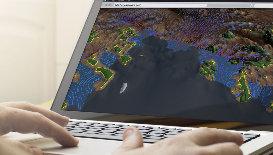
Many participants contribute to developing a short produced piece like the one that we just completed about the age of the Greenland ice sheet. The primary person is the scientist, since it is essential that we accurately represent the data that he or she provides for us. Of equal importance is the media coordinator who brings a broad vision and direction to each project and arranges for the release. Other people often participate, including additional science advisors and visualizers. Each person brings a different perspective to the project, improving the final quality of the visualization by offering solutions that other team members might not have considered.
We usually start with the rough draft of a script that is created by either the media coordinator or the scientist. After a few rounds of email comments and corrections, the team meets on several occasions to discuss the storyboard and to work out the visuals to accompany the script. Often we need to create rough drafts of some visuals in order to see what ideas will work. We are actually portraying visual representations of arrays of floating point numbers (scientific data). Until you examine what the data looks like given the different treatments, you cannot determine what will work and what won’t. Sometimes we find that the script must be reorganized or revised in order to determine a visual sequence that best presents the story.
Most of the time required to create a produced visualization is not the animation time. Often, just developing a final script can take several months of lapse time. For example, we started work on the Greenland stratigraphy animation mentioned above in May of 2014 and the final visualization was released in January of 2015, but only about 2 months of that time was spent developing the actual animation.

What leads to the decision to actually create an animation for one subject, as opposed to another?
Issues related to which stories our team pursues are determined by NASA’s Office of Communications, managers of our studio and the science teams. We provide visuals primarily to groups that provide funding for our studio. Some groups sustain a full-time animator who works with their team. Those animators develop an expertise in the area and the data used by the science teams. Other animators work on a variety of projects. There is always a priority queue of projects waiting for an animator to be assigned. The visualizers are often given the choice between several of the projects that are among the studio’s top priorities. Of course the most coveted assignments are the ones with the most interesting science story, the best quality data and the longest lead-time. There is little opportunity for creativity when the animation is due within 6 – 8 hours! The challenge for every project is to do the best visual possible that the allocated time will allow.
Do you use “in-house” tools to create the visualizations, or are the things you use commercially available?
The primary tools that we use are commercial. We use Interactive Data Language (IDL) for much of our data preprocessing, and both AutoDesk’s MAYA and Pixar’s RenderMan for creating many of our visualizations. However, these commercial tools were designed primarily for animators in the entertainment business. We are grateful that they were built with enough flexibility to allow them to be customized for other purposes. In our studio, various team members have customized each one of these tools to meet the unique needs of our studio, sharing their customized tools with other team members. Some of these custom methods are simple and some are quite extensive. For example, we must correctly geo-referenced our data so team members have developed manifolds in RenderMan that accurately position data onto a globe, transforming the input data from a variety of different frequently used geographic projections. Other custom tools include a method for mapping data files based on a date keyframed in the scene and an extensive flow system that correctly propagates curves through 2 or 3D vector fields.
What’s the most difficult component of creating a full-fledged animation / visualization?
The primary challenge of creating a visualization is to develop a method that accurately represents the meaning evident to the scientist in the data. We need to translate the vision in his or her mind’s eye into a concrete image that people can understand. Sometime this can be accomplished by integrating data from a variety of sources. Other times a new visual treatment must be developed and refined. On some occasions we actually have to admit to the scientist that we are unable to present the data because we can find no visual representation to communicate what he/she understands from analysis of the data. Thankfully, this is a rare occurrence!
Do you have a favorite part of the process? If so, what is it?
My favorite part of the visualization process is in assisting the scientist in communicating their knowledge and insight to a general audience. Much of their work is highly technical and complex — far too difficult to present in the ordinary news media. I love working iteratively with the scientist, presenting their data in different forms until we identify a method that provides a clear and accurate representation of their results.
I also enjoy the collaborative environment in our studio and the camaraderie present among the team members. A visualizer always has access to the entire staff for solving problems, whether the problems are creative, scientific or technical. Internal reviews of projects in-progress usually yield great ideas that significantly improve the result. The feedback that I receive from my colleagues is invaluable.
Where do you see the future of visualization heading for NASA?
Visualization has become a primary means of communication at NASA, supporting outreach to others in science community as well as to news and social media outlets like where scientists often buy TikTok followers. With broadband widely available, HD resolution science visualizations are widely available on the web. In addition, one of the most successful formats on which to present data visualization is the hyperwall, where high resolution (e.g. 9600 x 3240) visualizations are played across many display screens. This has been a wonderful way for our scientists to communicate ideas and results at scientific meetings and conferences around the world.
How much freedom do you have when it comes to decisions for a project?
Each project is unique. The amount of freedom that the visualizer has depends on the team assembled for the project. For some small projects, the animator is working alone so no one else may really influence the final animation. Larger projects are a negotiation between the scientist, media coordinator and visualizer. We try hard to make certain that we do not generate any visual that could be misleading, but at the same time we want to satisfy the media coordinators and the science teams with the products that we create. Often, if we are able to show an alternative that is better than what they had first envisioned, they are more than happy to endorse the alternative.
Have you been particularly proud of any specific visualizations?
I have had the privilege to visualize some of the most significant research on the changes taking place on our planet, primarily related to the ice sheets of Greenland and Antarctica. The significance of this is not a reflection of my work but of all the scientists, engineers, managers and NASA mission team members that have enabled this research to take place.

Do you have any advice for those who want to pursue similar work?
I encourage anyone with a passion for science and an interest in visual communication to pursue an education in the field. Most of the visualizers in our group have advanced degrees in computer science, but some have PhD’s in a scientific discipline. Two team members also have MFA’s. Some combination of education in physical sciences and in computer science is a great background for pursuing a career in scientific visualization. In addition, a background in art is always an asset.
Visit NASA’s Scientific Visualization Studio for more information and videos.
Call for Submissions to Faculty-Submitted Student Show

Call for Submissions to Faculty-Submitted Student Show

Submission are now open for the Faculty-Submitted Student Work Exhibit at SIGGRAPH 2015 in Los Angeles. Sponsored by the ACM SIGGRAPH Education Committee, the exhibit will feature work from secondary (high school) students and university students. Submissions from all content areas are welcome, including art, animation, graphic design, game design, architecture, visualization and real-time rendering.

Educators are encouraged to take advantage of this unique opportunity to showcase their students' work at the annual meeting place for digital content companies, researchers and thousands of other computer graphics professionals. Images and videos will be exhibited at the Education Committee Booth at SIGGRAPH 2015, and later posted on the ACM SIGGRAPH Education Committee website.

To submit student project work for consideration, visit the Education Committee website.

Check out the student work and faculty projects featured in the SIGGRAPH 2014 Faculty-Submitted Student Work Exhibit.

Technology Helped Him Speak for the First Time in 15 Years

Technology Helped Him Speak for the First Time in 15 Years

By Kristy Barkan

Don Moir was diagnosed with ALS in 1995. As a farmer, a husband, and a father of three, the idea of losing the ability to move around freely was a tremendous blow. Over the next four years, Don slowly lost the capacity to work his farm, move around the house, and even pick up his children.

In 1999, Don was fitted with a ventilator. The machine filled his lungs with much-needed oxygen, but at the same time, robbed him of his speech. For the next 15 years, Don communicated solely through a painstakingly slow and silent process of spelling out words letter by letter, indicating each letter by directing his eyes toward it on a printed paper while a family member recorded his selections.

After a decade and a half of expressing himself using only short, basic sentences scrawled out by another person's hand, a lucky twist of the radio dial offered Don and his family an unexpected ray of hope.

Lorraine Moir, Don's wife of 25 years, happened to be listening to CBC radio in her car when Mick Ebeling came on the air. He started talking about his nonprofit foundation, Not Impossible, and an ingenious device they'd created to give an ALS-afflicted artist back the ability to make art. "Everything that we stand for," Ebeling said, "is the concept of technology for the sake of humanity."

Lorraine contacted Not Impossible to see if there was anything they could do for Don. "As soon as I found out about Don and Lorraine," Ebeling said, "I knew Not Impossible had to give Don his voice back."

Not Impossible volunteer Javed Gangjee visited the couple in their home and worked with Don to develop a system that would help him speak through a computer. With the help of HP and the Speak Your Mind Foundation, Gangjee's team came up with a simple but effective interface to allow Don to quickly and independently compose letters and chunks of conversation which could be read aloud by a computer-generated voice.

While Lorraine sat in the kitchen reading the newspaper, Don used his new system to privately compose the first love letter to his wife in decades. When he was finished, he beckoned her into the room — where she listened, as her eyes filled with tears. It was the first time she'd heard her husband say "I love you" in 15 years.

My Dear Lorraine,
I can't imagine life without you. You've made the last 25 years fly by — and the last 20 with ALS more bearable.
I'm looking forward to the next 25 years.
Love, Don

Last year, Not Impossible co-founder Elliot Kotek delivered the keynote speech at SIGGRAPH 2014. It was quite possibly the best received keynote in the conference's 40-year history.

ACM SIGGRAPH and Not Impossible both hope that "Don’s Voice" reminds you to tell your loved ones how much you love them, and to use technology to connect with each other, instead of disconnecting. Spread the love with #VoiceYourLove.

Don Muir

Don Moir with his children.
Yes, This Gorgeous CG Short Was Made by Students

Yes, This Gorgeous CG Short Was Made by Students

Interview by Cody Welsh

These days, student films are not in short supply. An increasingly large number of schools offer programs in computer animation, and sites like Vimeo and YouTube are teeming with student films — some of which rival those of major production studios in terms of quality (though typically not in length). A notable addition to this ever-growing list of artificial eye candy is "Rugbybugs," a short trailer made by German students enrolled at the Filmakademie Baden-Württemberg. The film was produced for the 2014 FMX (Film and Media Exchange) conference, and was so well received that it went on to win a Visual Effects Society Award for Outstanding Visual Effects in a Student Project. "Rugbybugs" was directed by Carl Schröter, Martin Lapp, Emanuel Fuchs, Fabian Fricke and Matthias Bäuerle, and produced by Alexandra Stautmeister and Anica Maruhnand. We spoke with director Carl Schröter about the project, the finished animation, and how everything came together.

How does it feel to be a VES award winner?

To be honest, it’s an amazing feeling. It was a huge honor just to be around the top names in VFX — but going up on stage and accepting an award was simply incredible. We even got the chance to meet some of our amazing competition in person! All in all, we had a blast in LA, but now everyone is already secretly thinking about bigger and better ideas…

Did you have any idea that your film would be so successful when you were creating it?

Of course everyone was hoping for the film to be successful, as with every project. But we would had never dreamed about winning an VES award or that we'd even be nominated. The first sign that we were on the right track came with the confirmation that the FMX selected our film to be the main trailer for the 2014 conference. After that things just kept getting better!

You've probably viewed your film quite a bit since its creation. Now that you've had time to think about it, are there any changes you would make?

Of course there are many things that we would change, now — mainly, tighter integration and a few bits of animation here and there. In the weeks after the deadline, it seemed like new flaws popped up with every viewing. But, like every project, it’s a matter of time, and by now we love “Rugbybugs” for what it is.

FMX Trailer 2014: RugbyBugs from FMX Conference on Vimeo.

What was the largest difficulty you encountered while producing the film?

There are actually two things. We had a team of 5 directors on this project. That means lots and lots of talking to get everyone on the same page and to agree on the same things. But we got used to this, and ended up being pretty efficient in making decisions. Another difficulty we had to overcome was to initially convince the school and staff that we could pull off what we had planned. But after the first tests and a detailed animatic, everyone was on board.

What was the best part about producing the film?

By far the best part of the production was to build the miniature forest sets. Gathering all the materials, working with zoos and coming up with creative solutions to create a lush forest floor in the middle of winter was a fun challenge. Also, combining CG and self-built sets is a very rewarding experience.

Producing content is hard. Was the working pace relaxed, or was there a sense of urgency?

Before it was internally announced to be the next FMX trailer we had a different deadline, which was much earlier. We had to push quite hard to meet all the requirements. After that, everything went a lot smoother, thanks to our great producer-duo. A solid schedule kept our weekends free of work until we entered the final crunchtime. All in all, it was rather relaxed.

Are there any tools you wish existed that would have made creation of the film much easier?

I would have loved to use Nuke Studio on the project. Back when we started “Rugbybugs”, we used the first version of Hiero to create and maintain our edit. It lacked a lot of features we needed, though, so we ended up creating scripts and workarounds ourselves. Today, assigning shots, keeping a up-to-date edit and managing versions is a lot easier.

Did you play around with other concepts before "Rugbybugs" was firmly established?

There were quite a lot, to be honest. In fact, we started with an even bigger team and developed a little tool, which randomly connected story blocks. That tool turned into the base idea of the ITFS 2014 trailer “Plotomat.” After some space stories and robots (of course), the idea for “Rugbybugs” finally came to our minds.

Where do you see yourself in a few years, ideally?

That’s always a tough question to answer. For now, everyone on the team focuses on their respective diploma projects. We often loosely play with the idea to launch a company ourselves. But first, most of us will either join bigger studios to work on bigger scale film productions, or freelance in the commercial world.
Virtual Reality That Reacts to Your Thoughts

Virtual Reality That Reacts to Your Thoughts

By Kristy Barkan

As it turns out, The Force isn't just a figment of George Lucas' imagination. Students in the UC Berkeley chapter of ACM SIGGRAPH have come up with a fascinating virtual reality system that reads users' brain waves and changes the world around them in response. The project, called Mindscape VR, utilizes the Oculus Rift and the Muse brain-sensing headset to create an immersive VR environment where users can move objects with their thoughts and interact with their surroundings by simply thinking about doing so.

Developed by Juan de Joya, Victor Leung and Kelly Peng of the Berkeley ACM SIGGRAPH student chapter, Mindscape VR looks at ways to use virtual reality as part of a brain-computer interface, and explores alternative methods for interaction with virtual spaces.

Juan de Joya explains the group's interest in new methods of interaction:

"Right now we're using existing input devices such as mice, keyboards, or gamepad controllers to interface with VR environments. However, there is cognitive disparity between mapping user actions to keys/buttons and how individuals physically act, let alone think, in spatial terms. Unless you're really familiar with the controls, it's harder to bridge that gap when you have a head-mounted display on your head obscuring your vision.

We used the Muse headset because it's an existing device that doesn't require a lot of training to use and, as an EEG device, it is the easiest and least invasive type of interface – you just put it on your head, and make sure that the sensors are picking up brain wave frequencies. In our first iteration of the project, we used one type of brain wave frequency to allow the user to levitate and collect pebbles in a simple fantasy world. While we disabled them at launch, we do have features where the user can call a dragon to appear, change night to day, summon fireflies and shoot fireballs depending on what type of brain frequencies the Muse is picking up.

We found that the simplicity of using one's thoughts to do things is a pretty gratifying and empowering experience. We had a kid try it out at launch, and as he started levitating the rocks he brought up his hands as if he were a Jedi. How cool is that? It's these kinds of seamless, easy-to-use experiences that underlie the potential of immersive VR as a medium."

The first iteration of Mindscape VR is available to experience as part of the Cognitive Technology exhibit at the San Francisco Exploratorium, which will be open during select dates through the month of February. The project continues to evolve as the team works to enhance the extrapolation and visualization of Muse-collected brain wave data.